
Featured image and Jamboard picture:
3-ESS2-2. Obtain and combine information to describe climates in different regions of the world. Analyzing data in 3–5 builds on K–2 experiences and progresses to introducing quantitative approaches to collecting data and conducting multiple trials of qualitative observations. When possible and feasible, digital tools should be used. Represent data in tables and various graphical displays (bar graphs and pictographs) to reveal patterns that indicate relationships. (3-ESS2-1)
“Hello 3rd Graders!
Here in Portland, we experience many different types of weather. We have high temperatures in the summer and low temperatures in the winter.
Not every place, though, has the same weather as us.
Below you will see a screenshot of today’s Jamboard. Labeled is countries around the world.
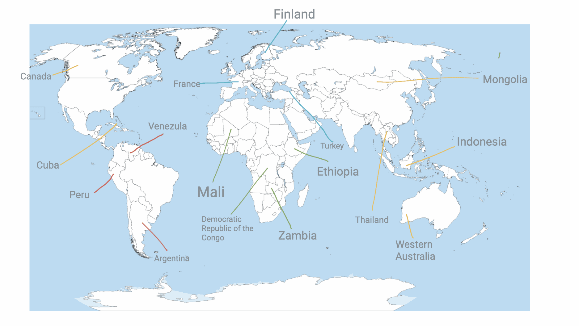
You with a partner are going to pick a country (there is a slide for each country) and find the average weather of each month.
A country can have a large range of weather depending on its size (think of Portland’s cold weather compared to Florida’s hot weather) so you will research two cities on either side of the country to compare (cities are specified on country’s slide)
You will then represent the 2 cities in a graphical display of your choice (table, bar graph, pictograph, etc)”
Sample of final product – My example below of Finland’s weather:
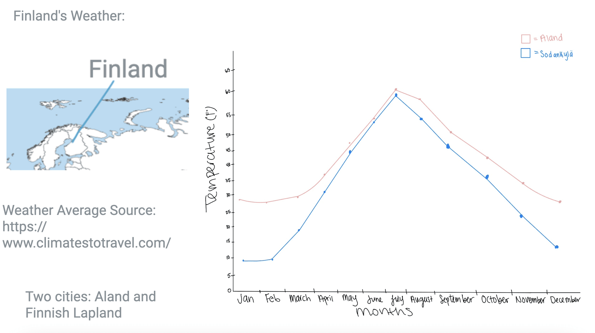
(My graph done on my iPad)
How tech resources and tools support reaching instructional goal: The state standard is to analyze data of weather from different regions and using technology gives the students the tool to find the data to analyze.
Jenna, I like the lesson. It’s a interesting mashup of geography, science and mathematics. So why did you choose Jamboard?
I think Jamboard does work because it allows you to have a map display and a space to create a graph. You might even consider giving them another slide to find some images to “illustrate” their selected country?
But Jamboard is not the best map display tool – we will be studying a versatile app – Google MyMaps later in the course. Likewise a graphing app – like Microsoft Excel, Apple Numbers or Google Sheets – could create a more attractive and accurate graph. Lots of choices for this lesson idea.