Sci-Notting the World Counters

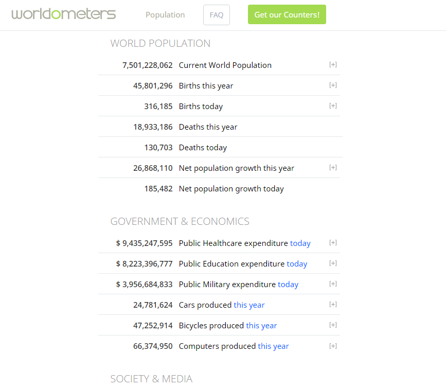
What you see above is a sample of what you would see if you went to World-O-Meters.  As you scroll around the page, you will see many different topics like military spending, agriculture, water usage, production of electronics, social media, and so on.  This site is a giant world counter.  It is not entirely accurate, but a lot of math and trend observations went into making this as accurate as possible.  And this site is perfect for introducing and teaching scientific notation.

Prior Knowledge Needed:  Exponent Rules

Lesson Begins:

So, what is scientific notation?  In layman terms, scientific notation is the way of writing very large or very small numbers in a more compacted and readable version.  Writing or typing, it is still quite tedious to write/type a number like 123456789086432477043146.  Scientific notation allows us to rewrite this in a compacted form and we could probably round off somewhere since most of the numbers are useless.  Though, if you are in the science and medicinal fields, those numbers are important, but it would be a hassle to write all those commas.

Day 1:

Introduce World-o-Meters and have them explore the site a bit on their electronic devices (Chromebooks, iPads, phones, etc.).

Introduce the concept of scientific notation.  Ask if students know what it is since they may or may not have encountered the concept already in their Science class.  Most common reply would be “It’s a way to make writing big numbers easier“.  If there are students who never heard of scientific notation or need a refresher, do some examples on the board like 16,000 and ask them to turn it into scientific notation.  Answer:  1.6 x 10^4.  Just remember that the decimal point has to go behind the first nonzero number or the number in front of the decimal point has to be greater than 0 and less than 10 (0 < n < 10).

After that, spend the rest of class having the students practice writing topics of interest in World-o-Meters in scientific notation and then turning it back into standard notation (1.6 x 10^4 = 16,000).  I suggest having students switch papers and practice writing their peers’ answers in standard notation.  If you have time introduce the concept of negative exponents in scientific notation.

Day 2

Bring back World-o-Meters and begin class by stating that now that we can write in scientific notation, we can now use scientific notation to compare the date behind us.  Like life vs death, emails sent vs tweets, car production vs bicycle production, and so on.  And we can compare these topics by using multiplication and division with scientific notation.

Before letting them go choose what topics they want to compare, go over the how we can multiply and divide in scientific notation.  I suggest that you put an example on the board like 5.2 x 10^2 x 2.1 x 10^2 and having them explore that with their peers.  They should find out that they should multiply or divide the front numbers and add or subtract the exponents respectively.

After that is written in their notebooks, they are free to go onto World-o-Meters and explore possible comparisons in the world.  They would have to convert the number into scientific notation before they can multiply or divide accordingly.  I recommend that the students round the numbers to the nearest thousandth for easier writing.  Just remember that for n.6539174:  0 < n < 10.

After students have their comparisons, have them come up and share because it would be interesting what students thought they could compare.  Just look if they multiplied (add) or divided (subtract) correctly.

That’s all for now.  I’ve actually experienced this lesson in one of my classes and thought it be cool to keep.

Featured Image:  Colored World Map

Google Trends as the First Step in Research

A student is looking at an essay prompt, he or she is overwhelmed and intimidated. They’re torn because they can’t decide what they want to write about, but the teacher was so insistent on leaving the prompt more open to the students.

A student has chosen what to write on, but doesn’t know what angle to take with it.

Maybe they’re looking for a fast and analytical way to compare and contrast two or more concepts.

Fix all of this by putting Google Trends in front of students. Teachers can use Google Trends as a measure of popularity over time within the last decade or so, giving students a statistical understanding of cultural relevancy that they can then analyze to understand what pulls people toward certain things. For example, if you search the names of some Shakespeare plays, you can see that people search Shakespeare way more during conventional school seasons, dipping in winters and summers. It’s a whole new source of information that gives statistical data accurate to what is relevant in the world today.

Check it out!

Immigration Unit

With candidates like Marine Le Pen and policies like Brexit cropping up internationally, and much national focus on immigration and border control, immigration and the human rights issues that surround it are topical and relevant issues for all groups of students. I’m a big proponent of using my platform as a teacher to promote social awareness (regardless of personal opinion), and English/Language arts is particularly well suited to helping students build this kind of empathy.  Reading, absorbing, and analyzing literature is as close as one can get to living through the experiences of the author and the situations they are writing about.

One particularly excellent text about immigration, that I hope to teach in my classroom wherever I land, is a wordless graphic novel called The Arrival, by Australian artist Shaun Tan. Despite being wordless, it manages to convey incredibly sophisticated themes that are politically neutral, since the story is visual fantasy and is not set in any particularly identifiable time or place. Because of its neutrality, it allows readers to connect with the characters without necessarily conveying blame, or causing the reader to become defensive. Students experience along with the characters the displacement and loss of leaving a homeland, the adaptation to new customs and places, and eventual reunion with family. It’s fabulous.

An excellent tech tool to go along with this text is the Metrocosm World Immigration Map. In much the same way that The Arrival removes the otherness of immigration through the sympathetic characters, this tech tool normalizes immigration by showing that people are coming and going from nearly every country, and that immigration is a global process rather than an isolated perceived annoyance.

Featured Image: Graphic Novel illustration by Laurence Hyde retrieved from Flickr

Groovy Rates of Change

Groovy

What is groovier than using the word groovy?  Answer: Being able to use tech tools to realize the relative usage of the word “groovy” throughout time and thus conclude that perhaps your smooth colloquialisms might not be so smooth or hip after all.  Good news: There is an abundance of alternative adjectives; maybe with some more research you can identify your optimal adjective of choice.  

Which brings us to the reason for thinking about word optimization after all – as a slightly more creative method of learning about rates of change, critical points, and optimization in a Calculus class.   I’ve designed a lesson that involves students researching word usage to apply the information they will have learned just prior.

After this lesson, students will be able to:

  • Identify on which intervals a function is increasing or decreasing. 
  • Identify whether slope over an interval is increasing or decreasing at an increasing rate (accelerating) or a decreasing rate (decelerating).
  • Label critical points and make conjectures about the cause of these points.
  • Identify local and global maxima and minima (ie. extrema).
  • Apply the Extreme Values Theorem to a graph and explain why, when the conditions of the theorem are satisfied, it assures that the given point is a global maximum or minimum.

Tech Tool to be Used for the Activity – Google Ngram Viewer

Basically, students will use Google Ngram to look up word usage over time and select a few of the resulting graphs to analyze to practice applying what they will have just learned about the topic in a fun way.

For example, students might look up the word “groovy” – yes, I said it again… I’m just helping the search rankings for this poor antiquated word to go up a tiny percentage (I should know better than this) – and the following result will appear:

I particularly like this example because of its graphical qualities – it has a clear increase and decrease and is not very choppy.

Once students have found a “nice” graph, they will then identify a given list of qualities such as maxima, minima, extrema, signs of the slope (derivative) within intervals, and signs of the derivative of the derivative (acceleration) within intervals.

Next, in order to connect this activity to real life, I will ask students to make predictions about why a word gained or lost popularity over a given time period.  To make an informed prediction, they might research relevant events that occurred in the given time period and how this might then have affected common word usage.  In essence, I want them to realize that graphs tell stories and that math is a tool that we can also use to communicate, illustrate, and explain these stories.

Featured Image : Teresa Boardman

Visualizing Mathematical Functions

One data visualization tool that would be helpful for students to use in a math classroom is Desmos graphing calculator.  I could use Desmos in a lesson about graphing sinusoidal functions.  I might begin the lesson by instructing my students to log on to Desmos and simply modify the equation y=sinx in any way that they wish.  I would instruct them write down what they observe as they do so.  After they have had some time to explore, I might provide a worksheet for some more guided practice.  The worksheet might ask them to do things such as add a constant to the equation y=sinx and observe what happens.  Students should notice that the graph is moved up by whatever constant they added, like in the image below.

The worksheet might also ask them to multiply the sine curve by a constant.  When doing so, students should notice that the sine curve gets taller.

The use of Desmos graphing calculator allows students to quickly and easily see how modifying the equation y=sinx changes the graph.  Once students have any idea of different modifications change the graph, I would introduce formal vocabulary for the modifications.  For example, adding a constant creates a vertical shift and multiplying by a constant changes the amplitude of the sine curve.

Image credit: Dylan Ng

Are you a Loyalist or a Patriot?

In fifth grade, the social studies standards generally cover the founding of North America, the lead up to the Revolutionary War, and the war itself.  In some exploring of these data visualizations websites, I think I would want to use the US News Map website to help students visualize what attitudes different populations of people had regarding the Revolutionary War and the separation of the American colonies from Great Britain.  This website would be a great way for students to see where exactly different groups of people lived based on their political opinions expressed in newspapers of the day.  They can search for key words such as “Loyalist” and “Patriot” and this website will show them where the terms were used most heavily in newspapers in different regions.  I think this would be a great resource to just let my kids explore and discover different patterns for themselves instead of me telling them something like: “Most Loyalists lived in New England…” With this, they can discover that for themselves, as well as get the opportunity to read some primary source documents from the time period.

Revolutionary War Reenactment #1

Predicting the Next Big Blockbuster

To add some spice to the class and really relate to the kids while teaching them about trends and graphing data, I’d love to use the bookworm movies site. Just browsing the site and playing with it was really cool. So cool, in fact, that I would definitely want my kids to play around with it for a while and see what they would think about it. By the way, this would definitely work well with a class/unit/lesson dealing with collecting data, analyzing trends, etc.


Here’s how the lesson would look like (coming to you live from my brain):


5 Minutes: Take a survey of the class concerning their favorite movie/genre of movies. We would use this data to come up with a graph. From this data, we would also list the different stereotypes (archetypes?) that are common throughout that genre of movie, ie hero always saves the day, the nerdy girl is always asked out by the popular guy, red coats die first, stormtroopers always miss, etc. etc.

15 Minutes: The next part of the lesson involves introducing the students to the website bookworm: movies and having them search those phrases. Using this website, the students are able to filter the results they get.

In the image above, you can see just how specific students will be able to be when searching for phrases and/or individual words. During this introduction, the teacher/facilitator will give the students 2-3 example searches to test out on the site, just so that the students become familiar with the site and its features. The students will then be turned loose and left to their own devices; searching for words/phrases that either pertain to their favorite movie genre, or just phrases/words in general that they’d like to see data on.

5 Minutes: Yoga break! Students will be asked to turn away from their screens for some body moving time or optional class yoga. Studies show that students start to lose interest (basically shut their brains off) 30 minutes into a lecture/class/whatever it is that they’re doing and they’re not particularly interested in. So be proactive and get your students active!

Remainder of class: The remaining class time will be set aside for discussion. After the yoga/movement break, students will go back to the data they’ve looked up and share it with the class or in groups (whatever tickles the teacher’s fancy). The class will then be asked the following questions:

  1. Were there words/phrases that you tried to look up and couldn’t find? Why do you think that was?
  2. What did you notice about the trends in the data and the time period during which they occurred?
  3. Pick a graph comparing at least 2 phrases. (Pretend they picked the one below)

What do you predict will happen to this graph in the next 5 years? 10 years? How do you think the usage of these words/phrases will change over time?


And That’s a Wrap! : Students will then record their findings in either a journal or on a separate piece of paper and turn that in.

Aaaaaaaaaaaaaaand cut! You’ll be the coolest teacher around with this lesson. Guaranteed. (But not really. Don’t quote me on that. I don’t know the dynamics of your class and how they might react to this lesson. Just try it man. Nike.)


Featured image: Cinema Entertainment Film Reel Movie Projector on MaxPixel


Newsflash: Oldschool Authors Preferred Writing About the Devil Than God. Wonder Where They Ended Up, Eh?

I would have my students use Ngram to write about trends in literature pertaining to the use of God and the Devil. They would have to differentiate between actual religious texts and literature and make assumptions on the time period based on what they find. I really like this website because it shows somewhat perfectly what was written during a certain specific time period. I am free to incorporate history in the lesson due to time being such an important thing while using Ngram. This will also help the student’s research skills immensely–for they will have to interpret information based off of the graph that Ngram shows.

One thing I do not like about Ngram is how cluttered it is when looking at the books used in the graph. I wish there was a better way to sort through each book presented. I think that a better algorithm would help student’s research immensely. Other than that, I think it is a fantastic tool for seeing what words were used during certain specific times, as well as seeing how popular they were.

I find it absolutely fascinating that the word “devil” appears more in the 19th century than the word “god”. I am not surprised by it, but still fascinated. I think if a student had little knowledge of the literature being put out during the 19th century, they would be shocked by this fact. This is why Ngram is a great tool. It combines academic research and purely satisfying facts–the kind of satisfaction one gets when mindlessly reading Wikipedia.

I hope that one day the program will be updated so that more-than-three-word-phrases can be looked at. That should be a pretty easy thing to do, right? If that were the case, then everyone would be able to be a linguist! We’d be able to look at phrases and see where they were from and how much they were used. I think it is necessary for Ngram to develop an algorithm that would allow us to do this.

**The website is not allowing me to add a picture to featured image**

Are you destined to be unhealthy?

I remember using Gapminder World in High School. I specifically remember using it sophomore year when (as a grade) we were participating in a model United Nations. It gave teams the opportunity to learn large amounts of information quickly about both their country and other countries. It was a great tool and I was excited to plan a lesson around it after last class.


Picture a science health class in a 1-1 school (which is where I dream to be eventually). The students have just finished a unit on different global diseases and this is their final project and assessment for the unit.  In groups of two, students will pick a disease that Gapminder World has data on. Once they pick the disease they want to learn more about for their project the objective is to determine what are major influencing factors for that disease. For example, if I picked Malaria then I would chose different factors such as GDP, Education, Poverty and observe their influence on Malaria. Once I have manipulated and analyzed the different graphs the students will chose 1-2 factors that they want to research more.

The students will research the disease itself if it was not covered during the unit within the class. Finding information such as: how you get it, symptoms, and is there a cure?  They will also research the affect and impact that the one-two different factors had on their disease. The students will get multiple days to accomplish this. At the end they will have created a poster, presentation, video or some method of representing their group research. In class there will be a gallery walk where students will set up their project and get to walk around the classroom and see everyone’s research.

Lesson Objectives:

Students will be able to manipulate and interpret data of a health disease to determine important factors.

Students will be able to research their disease and important factors after analyzing and interpreting the data.

Final Product:

A representation of the research on both the disease and its important factors. Could be a video, poster board, presentation, etc.


For an assignment such as this one I wanted to do a student led project. I wanted students to be invested in what they were researching so I let them chose their own disease. I also wanted to let students use their creativity and imagination in presenting their findings. Often assignments and projects in classes tend to be very scripted so I wanted a project with more freedom.

I also wanted the students to be able to play around with the program and learn how it worked along with the different methods it has for representing data!